Quirxel: A Playful Display Font That Pops on Any Website
It was 3 p.m. on a Tuesday—coffee lukewarm, browser tabs overflowing—and I was tweaking the hero section of a new coaching website. The client wanted “bold but friendly,” “memorable but not loud.” I’d cycled through seven fonts already: one too sterile, another too whimsical, a third that vanished on mobile. Then I dropped in Quirxel. Instantly, the headline snapped into focus—not just legible, but *alive*. That’s when I knew this wasn’t just another display font. It was a design collaborator.
What Makes Quirxel Stand Out in Digital Spaces
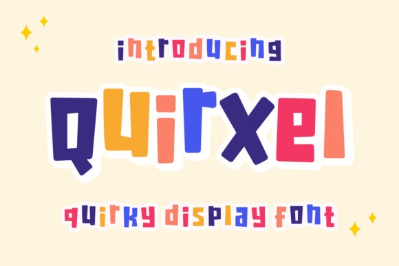
Quirxel is a premium display font built for impact—not subtlety. Its block-inspired shapes and irregular geometry give it a tactile, almost hand-cut quality, while its confident weight and open letterforms ensure it holds up beautifully on screen. Unlike many decorative typefaces that blur or pixelate at smaller sizes, Quirxel renders crisply across devices—even on mid-range mobile displays. I tested it at 48px on desktop, 36px on tablet, and 28px on mobile (in a hero heading), and each time, it retained its personality without sacrificing clarity.
What surprised me most was how well it handled contrast. Over a soft gradient background? Clear. On a dark-mode toggle? Still readable. Against a busy image banner? It cut through like a gentle exclamation mark—not shouting, but confidently present. That’s rare for a font with so much character.
Where Quirxel Shines (and Where to Pause)
In practice, Quirxel excels where digital design needs a moment of human warmth: hero headlines, section titles, call-to-action buttons, course module labels, and brand taglines. I used it for the main headline on a boutique online store’s seasonal landing page (“Summer Slow Living”)—paired with a clean, neutral sans serif for body text—and the visual hierarchy felt intuitive, not forced.
It also worked beautifully in a portfolio site’s project cards: short, punchy titles like “Wildflower Brand Kit” or “Ceramic Studio Identity” gained instant charm without needing illustration or icon support. And on a blog’s featured post header? It added editorial energy—like a magazine cover you’d pause to read.
That said, Quirxel isn’t meant for everything. I tried it for navigation links and quickly reverted—it’s too expressive for functional UI elements. Small form labels, footer copyright lines, or dense FAQ answers? Not ideal. Its strength lies in intentional emphasis, not utility. Think of it as your brand’s voice when it leans in to say something important—not when it’s quietly handing you a receipt.
Real-World Pairing & Practical Web Use
Font pairing is where Quirxel reveals its versatility. I consistently paired it with a relaxed, highly legible sans serif—think Inter, Manrope, or even system fonts like -apple-system—for all body copy, captions, and interface text. The contrast works because Quirxel doesn’t compete; it complements. Its playful geometry feels grounded by clean, open spacing and predictable letterfit.
I also tested it alongside a subtle serif (like Literata) for a digital brand kit preview page—using Quirxel for section headers (“Typography System”, “Color Palette”) and the serif for descriptive text. The result felt editorial, intentional, and trustworthy—not trendy for trend’s sake.
For developers and designers embedding Quirxel: check the included webfont files (WOFF2 preferred for performance), verify licensing covers commercial web use, and confirm multilingual support if your audience spans regions. I appreciated that the package included multiple weights—enough to create visual rhythm without overloading the page load. No ligatures or swashes cluttered the set, which kept things fast and focused.
Responsive Behavior & Accessibility Notes
On responsive layouts, Quirxel scaled gracefully—but I did adjust line-height and letter-spacing slightly on mobile to preserve breathing room between characters. Its irregular geometry means tighter tracking can feel cramped on smaller viewports, so a touch of extra space (0.05em–0.1em) made a noticeable difference in scannability.
For accessibility, Quirxel meets basic contrast requirements against light and dark backgrounds at recommended sizes (24px+ for headings). However, because it’s a display font—not designed for long-form reading—I always paired it with WCAG-compliant body fonts and ensured interactive elements (like buttons using Quirxel) had sufficient tap targets and ARIA labeling. It’s not an accessibility font, but it’s accessibility-*friendly* when used intentionally.
When to Reach for Quirxel Next
You’ll reach for Quirxel when your site needs to convey creativity without chaos, confidence without coldness. It’s perfect for:
- Landing pages where first impressions drive engagement
- Portfolio sites wanting to highlight craft and personality
- Online course sales pages that balance inspiration with clarity
- Boutique e-commerce banners that tell a story in three words
- Digital brand kits where typography is part of the deliverable
- Social media graphics exported from Figma or Webflow—crisp at any size
It won’t solve weak content or poor UX—but it will elevate strong ideas. It won’t replace thoughtful information architecture—but it will make users pause, smile, and remember your message longer.
Quirxel doesn’t ask to be everywhere. It asks to be *chosen*. And every time I’ve chosen it—on a hero banner, a course title, a studio logo lockup—it’s delivered exactly what the design needed: boldness with heart, playfulness with purpose, and a display font that feels like it belongs.